UI in products comes in various shapes and forms - Quite literally! Modern products fall into the hands of end users through web browsers or native applications. These platforms further have their nuances. Another reality of today is that the same utility is often exposed through multiple UI outlets. Think of booking movie tickets - You could go to a URL on your web browser and book a ticket, from your laptop or mobile browser or you could install the Android app, or even do the same on an iOS app.
Most Web UI is powered by Javascript-based UI frameworks like React. When it comes to mobile apps, the choice of UI frameworks is often between cross-platform solutions like Flutter or React Native or native stacks like Kotlin, Compose on Android, and Swift/SwiftUI on iOS.
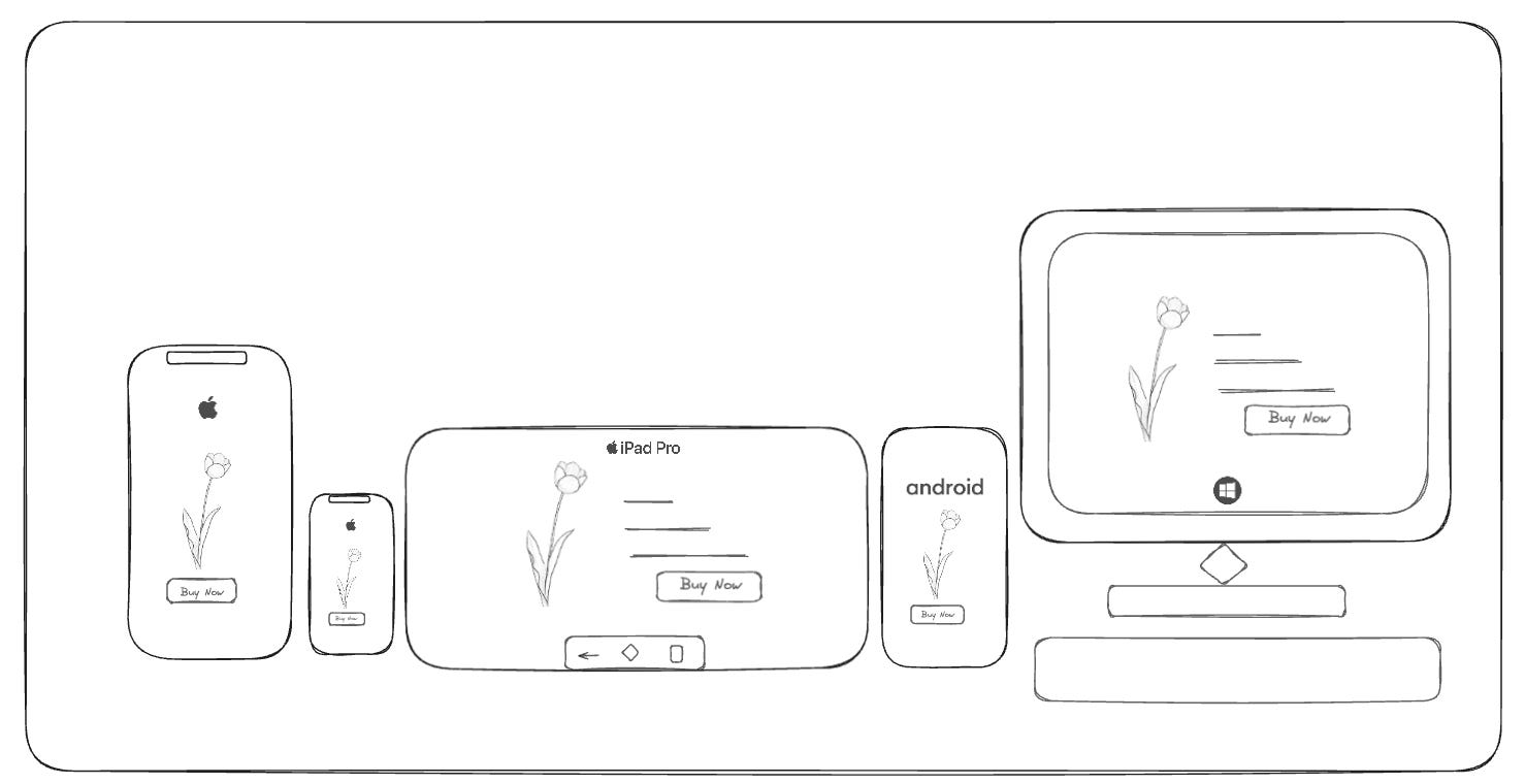
Waohh! These are too many different ways to do the same thing → Giving the user an interface to book a freaking movie ticket.
My experience of working with UI-heavy applications over the past few years made me wonder if there could be a Holy Grail of UI development. If there can be one standard to unify different ways to do UI? Can there be one language that is common to the many UI technologies?
Imagine you could write just one technical specification for all UI platforms and it could express building UI across all platforms. Just to clarify, I did not intend to find one unique way to write code that could run across Web, Browser, or Mobile Apps but a language that could express the same UI as one.
Let’s see through an example
Imagine you are building a form that contains a series of questions, some images, and a submit button.
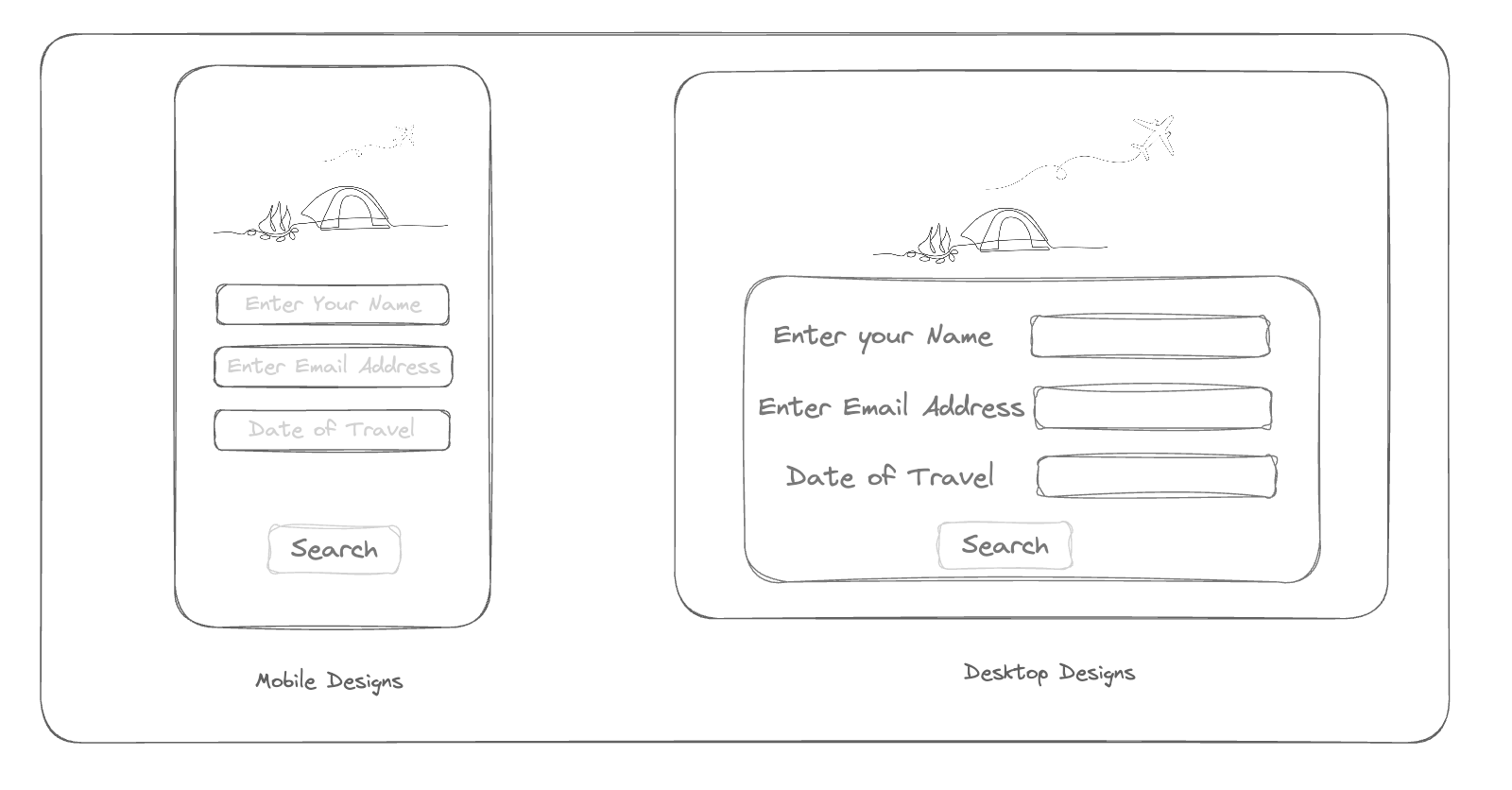
Here’s how the basic implementation across different platforms might look -
1. React
import React from 'react';

function PurchaseForm() {
    return (
        <div>
            <form>
                {/* Series of questions */}
                <input type="text" placeholder="Enter your name" />
                {/* ... more questions ... */}

                {/* Some images */}
                <img src="path-to-your-image.jpg" alt="Description" />
                {/* ... more images ... */}

                {/* Submit button */}
                <button type="submit">Submit</button>
            </form>
        </div>
    );
}

export default PurchaseForm;
2. Angular
import { Component } from '@angular/core';

@Component({
  selector: 'app-purchase-form',
  template: `
    <form>
      <!-- Series of questions -->
      <input type="text" placeholder="Enter your name">
      <!-- ... more questions ... -->

      <!-- Some images -->
      <img src="path-to-your-image.jpg" alt="Description">
      <!-- ... more images ... -->

      <!-- Submit button -->
      <button type="submit">Submit</button>
    </form>
  `
})
export class PurchaseFormComponent {}
3. SwiftUI
import SwiftUI

struct PurchaseForm: View {
    var body: some View {
        Form {
            // Series of questions
            TextField("Enter your name", text: .constant(""))
            // ... more questions ...

            // Some images
            Image("name-of-your-image")
            // ... more images ...

            // Submit button
            Button(action: submitForm) {
                Text("Submit")
            }
        }
    }

    func submitForm() {
        // Handle the submit action
    }
}

struct PurchaseForm_Previews: PreviewProvider {
    static var previews: some View {
        PurchaseForm()
    }
}
4. Flutter
import 'package:flutter/material.dart';

class PurchaseForm extends StatelessWidget {
  @override
  Widget build(BuildContext context) {
    return Scaffold(
      body: Form(
        child: Column(
          children: <Widget>[
            // Series of questions
            TextFormField(
              decoration: InputDecoration(
                hintText: 'Enter your name',
              ),
            ),
            // ... more questions ...

            // Some images
            Image.asset('path/to/your/image.jpg'),
            // ... more images ...

            // Submit button
            ElevatedButton(
              onPressed: () {
                // Handle submit
              },
              child: Text('Submit'),
            ),
          ],
        ),
      ),
    );
  }
}
Imagine you are an engineering manager. Your product is accessed by users through an Android App, an iOS App, and a Web App. The question for you is → Can you write one technical spec and pass the same to different UI teams including the Android team which implements Jetpack Compose, the iOS Team which uses SwiftUI, and the Web team which uses. If you look closely at the end goal here to do the same thing, then why do you need to express this in different languages across different platforms?
Most modern frameworks are declarative. This means the foundational ways these frameworks express painting on a canvas could be similar.
My attempt at generalizing these expressions resulted in a common language across heterogenous UI mediums, which I call P2D2.
Introducing P2D2
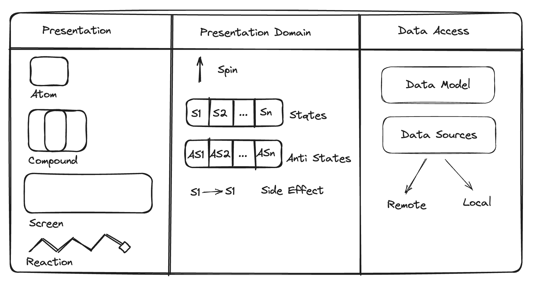
P2D2, or Presentation, Presentation Domain, and Data Access, is a technical specification language forged from the real-world challenges and triumphs of developing UI across multiple platforms. Think of how something called "Unified Modelling Language” helps you express object-oriented concepts. This language is meant to help you express UI in the same language across different UI platforms.
The worlds and workings of a designer, product manager, and a frontend engineer are so different. Imagine them speaking the same language while expressing what is to be built. This would mean zero gaps in translation.
When used effectively, P2D2 can be a game changer in how different disciplines (say design, product, engineering) work on the same piece in their different worlds.
We will circle back with concrete examples of how it can help these teams once we have basic understanding of how it all adds up.
The very name “P2D2” is composed of three logical layers any UI application can be broken down into. These are
Presentation
Presentation’s Domain
Data Access
Two ‘P’s and Two ‘D’s
The Presentation Layer
Imagine a Lego set. Now, think of the smallest representable pieces as 'atoms'. These atoms are the building blocks of your UI. They're everywhere, from the simplest app to the most complex software.
The Presentation layer contains the "dumb" UI portions, that are not aware of any data or state. It consists of four categories: atoms, compounds, screens, and reactions.
Atoms: The Tiny Titans of UI
Think of atoms as the Legos of your UI. They're the tiny, reusable building blocks that form the foundation of every screen, every button, and every element that greets your user's eyes. Buttons, text fields, icons – these are the atomic. You can’t divide a UI any further than these.
Compounds: Atoms Assemble!
Just like Legos, atoms can come together to form more complex structures – compounds. These are the UI molecules, the building blocks of larger elements like menus, forms, and even entire screens. They're the result of atoms joining forces, their individual strengths combining to create something greater than the sum of its parts.
Think of a login form compound – an assembly of text fields for username and password, coupled with a submit button atom. Or imagine a compound like a navigation bar. It's not just a bunch of buttons thrown together; it's a carefully crafted unit with icons, labels, and spacing all working in harmony.
Screens: The Grand Canvas
Screens are the grand stage where compounds come together to tell their story. These are the largest representations of the UI and are scoped to anything that can be seen on the device.
Reactions:
Reactions define interactions of atoms and compounds to a well-defined UI stimulus or with each other. Imagine a button (atom) that is supposed to show collapse animation (reaction) when a user long presses it (stimulus). Intermediate reactions are usually short-lived. These are often expressions of UI/UX needs.
This could come in various other forms. Some examples are
A menu bar (compound) collapsing (reaction) when tapped twice (stimulus)
A button group (compound) auto-adjusting ( reaction) alignment (from horizontal to vertical) when the device’s orientation is changed from portrait to landscape (stimulus)
Please note, the stimulus is usually user actions, but these could be others too (Like example 2). Also, a reminder to not couple these with implementation. Often people get confused and start thinking of how to implement reactions in their react code. P2D2 is a technical specification language → You will see it in action more in PRDs, Engineering Specs than in code organisation.
Let us understand with an example,
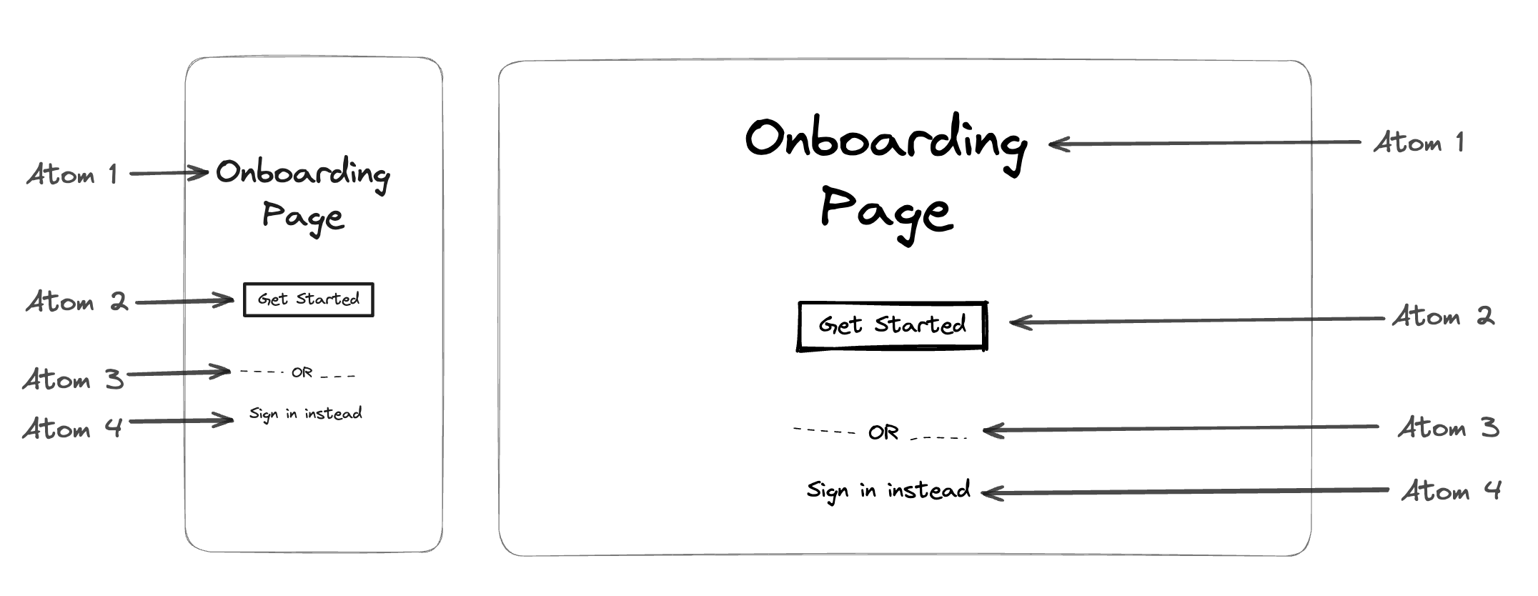
Say we were to build an onboarding page.
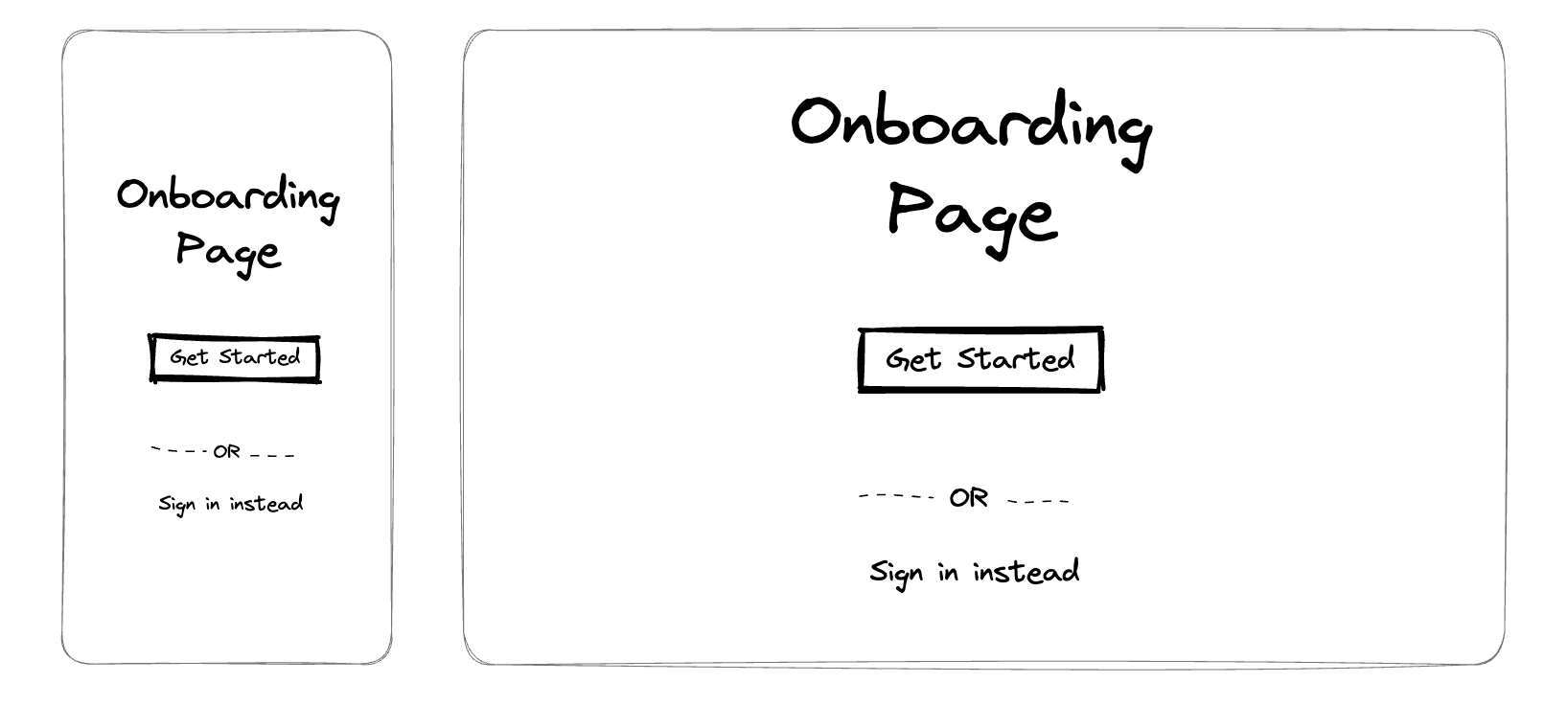
Let’s Figure out the Presentation Layer of this using P2D2
Atoms
A Primary text view containing “Onboarding Page”.
A primary action button saying “Get Started”.
A horizontal dashed separate saying “OR”.
A secondary action button saying “Sign in instead”.
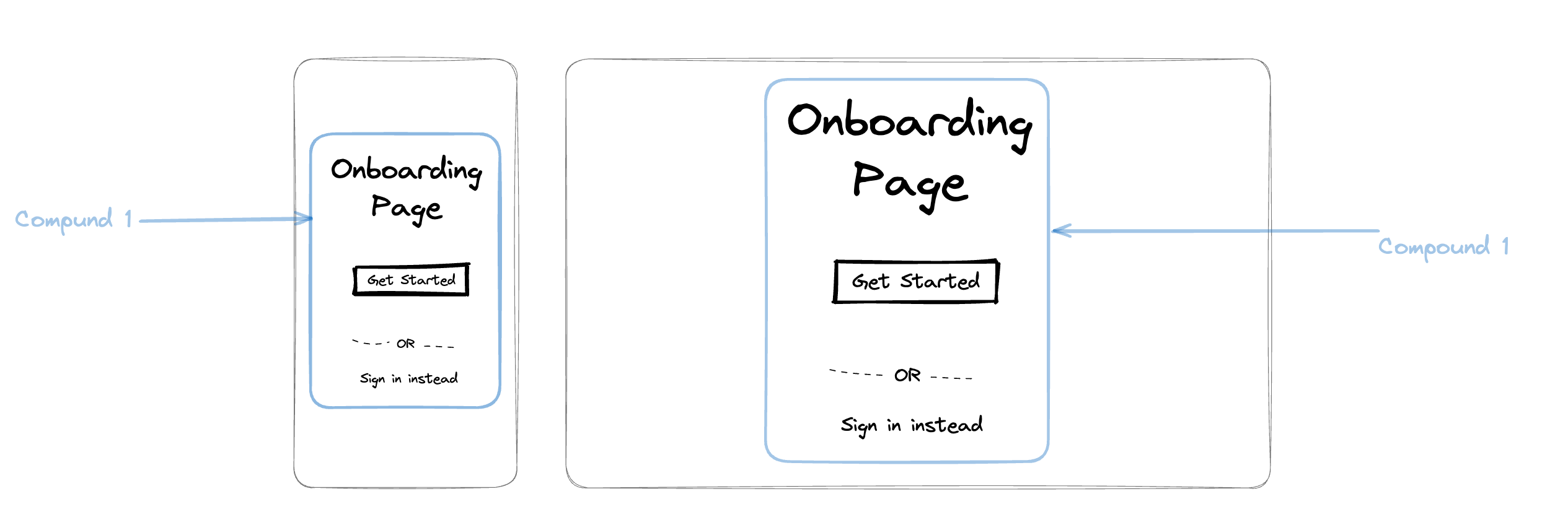
Compounds
Atoms 1 , 2, 3, & 4 Form the Onboarding Compound
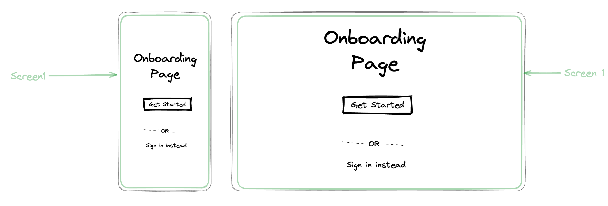
Screens
The Onboarding Compound is sufficient to make the screen by Itself called the Onboarding Screen
Reactions
To Change the background color of the Primary Button when user taps on it.
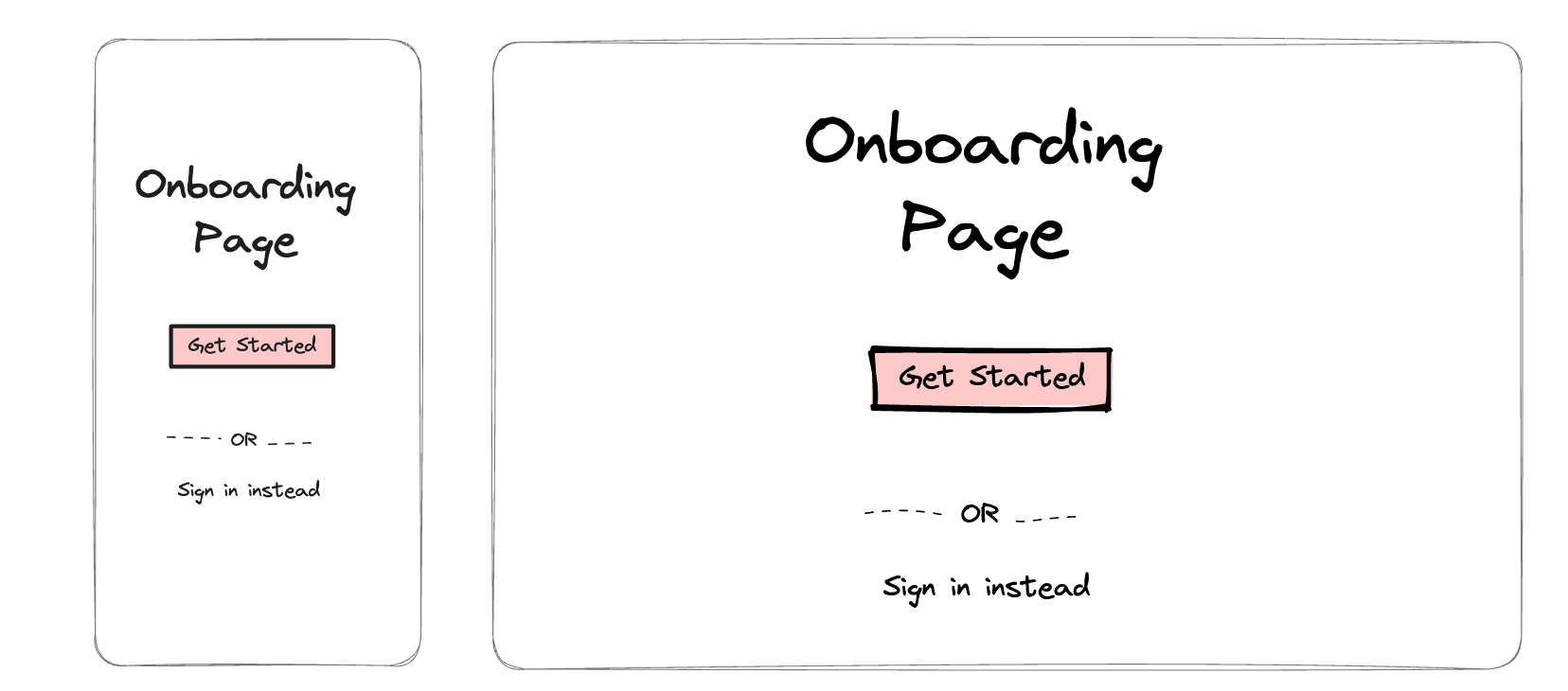
[Entity] → [Stimulus] → [Reaction]
Atom 2 → On Click → [Change Background Color: #34523f]
Try to see, if you can understand these reactions without even looking at UI
Atom 4 → On Click → [Change Color: #11eeee]
Atom 3 → On Atom 4 Action → [Set Visibility: Hidden]
The Presentation Domain
While the Presentation Layer is the part where UI elements pirouette, the Presentation Domain acts as the backstage director, whispering instructions, orchestrating state changes, and ensuring everything runs smoothly. It's the life-bridge between the ‘dumb’ UI and the lively world of data and user interaction.
How often have you seen a designer and a product manager wanting to express more than what Figma shows? It could be the specifics of how long an animation holds, or how many different states can a button (atom), or a navigation bar(compound) or even a screen can be? Presentation Domain is the part where all of these can be defined.
Think of it like this: Imagine a button on your screen. In the Presentation Layer, it's just an atom, a pixelated shell waiting to be filled with life. But the Presentation Domain injects that lifeblood. It defines the button's state – whether it's enabled, disabled, or loading. It dictates what happens when the button is tapped – triggering reactions, updating data, or navigating to another screen. It's the puppet master pulling the strings, making the button dance to the user's tune.
But the Presentation Domain isn't just about buttons and states. The beauty of the Presentation Domain lies in its separation from the Presentation itself. It's pure logic, untainted by pixels and animations.
But what exactly does the Presentation Domain do? Here's a breakdown of its core functionalities:
State Management: Imagine your UI as a living organism, constantly evolving based on user actions and data changes. The Presentation Domain acts as the memory of this organism, tracking the state of each UI element (e.g., button states, form values, loading indicators). This state management ensures consistency and coherence across the UI, even as users interact and data updates flow through.
Behavior Orchestration: Every click, swipe, and interaction triggers a chain reaction within the UI. The Presentation Domain defines and orchestrates these reactions, dictating what happens when a button is pressed, a form is submitted, or new data arrives. Think of it as the choreographer of the UI ballet, ensuring each element moves seamlessly in response to user input and data changes.
Side Effect Coordination: UI changes rarely occur in isolation. When a button is clicked, it might update a data model, trigger an animation, or navigate to another screen. The Presentation Domain handles these side effects, ensuring they happen in the right order and at the right time. It's the master of dominoes, ensuring each UI change triggers the next in a smooth and predictable sequence.
Data Abstraction: The Presentation Domain acts as a barrier between the raw data and the UI elements. It translates complex data structures into digestible states and properties that the UI can understand and display. This abstraction layer simplifies UI development, allowing developers to focus on logic and behavior without getting bogged down in data complexities.
How to Express Presentation Domain?
The Presentation Domain, in its purest form, is the hidden maestro of your UI, the conductor of logic and state that breathes life into your pixelated masterpiece. But how do you translate its magic into a concrete technical spec that guides developers and unifies UI experiences across platforms? Here's a breakdown:
1. Spin: The UI Atom's Inner Dance
Imagine a checkbox. Its state is not just "checked" or "unchecked," it's a dynamic tango of possibilities. The Presentation Domain captures this dance through the concept of "spin." Spin defines the possible states of a UI element (e.g., a button's "enabled," "disabled," and "loading" spins) and their visual representations. This ensures consistent behavior and appearance, regardless of the underlying platform.
Example:
Checkbox {
  spin: "checked"
  disabledSpin: "greyedOut"
  loadingSpin: "indeterminateSpinner"
}
2. State: The UI's Evolving Memory
Think of your UI as a living organism, constantly adapting to user interactions and data changes. The Presentation Domain tracks this evolution through "state." It stores the current values of UI elements (e.g., form fields, selection lists) and updates them dynamically based on user input and data updates.
Example:
ProductList {
  state: {
    selectedProduct: "product123",
    filter: "electronics"
  }
}
3. Side Effects: The Butterfly Effect of UI Change
A button press isn't just a pixel tap; it's a chain reaction of updates across the UI. The Presentation Domain orchestrates these "side effects" through defined actions triggered by state changes. These actions could be updating data models, triggering animations, or navigating to new screens.
Example:
Button {
  text: "Submit"
  onPress: {
    action: "submitForm",
    sideEffects: {
      updateState: { loading: true },
      navigate: { screen: "confirmation" }
    }
  }
}
4. Anti-States: The Data Shadows Behind the Pixels
Not all data maps directly to UI elements. Login credentials, network status, or user preferences exist in the background, influencing the UI but not directly displayed. The Presentation Domain captures these "anti-states" as separate entities, ensuring data integrity and smooth transitions between screens and states.
Example:
AppState {
  currentUser: {
    id: "user123",
    name: "John Doe"
  }
  networkStatus: "online"
}
5. Catalysts: The Sparks that Ignite Change
User interactions, data updates, and system events are the sparks that ignite changes within the UI. The Presentation Domain captures these "catalysts" as triggers for state updates and side effects. Think of them as the input signals that tell the UI conductor which symphony to play.
Example:
LoginScreen {
  onTextChange: {
    action: "updateFormState",
    catalyst: "username"
  }
  onSubmit: {
    action: "submitLogin",
    catalyst: "submitButtonPress"
  }
}
Remember, the Presentation Domain is not just a technical spec; it's a philosophy. By defining spins, states, side effects, anti-states, and catalysts, you create a unified language for UI development, enabling consistency, reusability, and delightful user experiences across platforms.
Data Access Layer
The land of ones and zeros, the playground of SQL queries and API calls, the hidden kingdom where data pirouettes and logic does the hustle. Data Access Layer (DAL) plays a fundamental role, acting as the stoic bass line anchoring the UI's vibrant melodies. It's where data dances to the tune of logic, ensuring consistency and accuracy across diverse platforms.
Let's delve deeper into its key components:
1. Data Models: Shaping the Data Landscape
Data models are the blueprints for your app's data, defining its structure and relationships. They differ from presentation domain models, focusing on optimal storage and retrieval rather than UI-specific details. Think of them as the building blocks of your data ecosystem.
2. Data Sources: Tapping into the Information Reservoir
Data sources are the gateways to your app's data, connecting it to various external repositories. APIs, databases, and even local storage can be leveraged, providing a diverse landscape of information sources.
Presentation Domain States vs Data Access Data Models
Data models are representations of the app's data, and they may differ from the data models used in the presentation domain. For example, a data model called "Doctors" in the data access layer may need to be translated to a "DoctorsList" model in the presentation domain, as the latter makes more sense to the UI layer.
While expressing Data Access is quite straightforward across teams. Let us understand why is it important.
For Engineers, the DAL is a fortress of stability. It provides a well-defined interface for accessing and manipulating data, shielding them from the complexities of platform-specific implementations. Think of it as a secure vault, where data models are meticulously crafted and guarded, ensuring reliable access and consistent behavior across Android, iOS, and the web. This stability empowers engineers to focus on building robust logic, confident that their efforts won't be undermined by platform idiosyncrasies.
For Designers, the Data Access Layer is a canvas of possibilities. It allows them to focus on crafting intuitive and delightful UI experiences without being bogged down by data complexities.
But the DAL's true power lies in its ability to bridge the gap between data and design. By abstracting data models and exposing them through a consistent interface, the DAL empowers designers to think beyond the pixels, allowing them to reason about data relationships and user interactions in a platform-agnostic way. This fosters a deeper understanding of how data drives the UI, leading to more informed design decisions and ultimately, a more cohesive and delightful user experience.